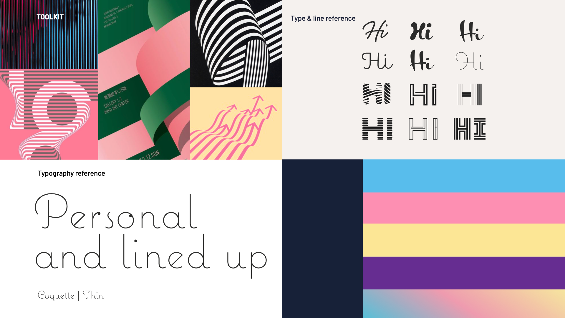
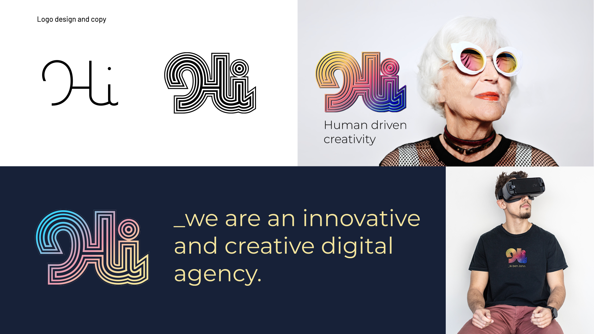
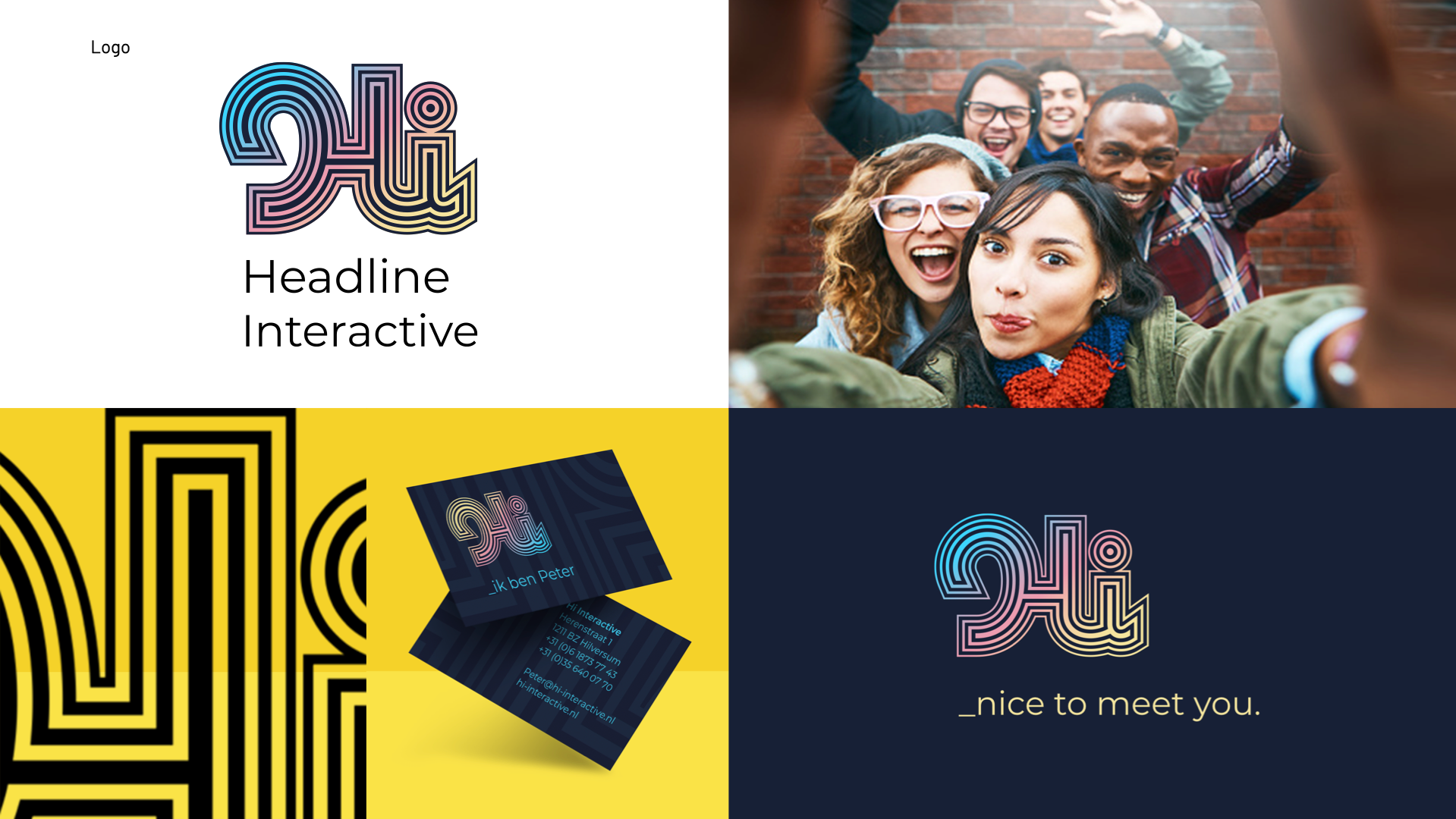
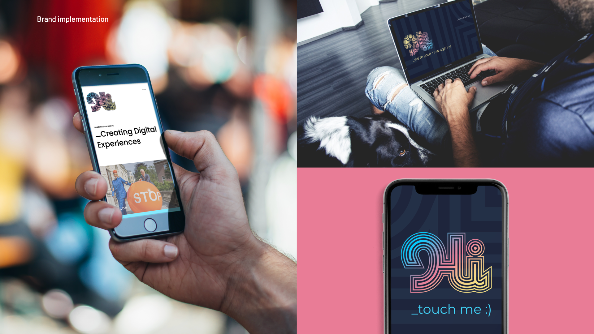
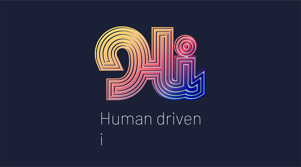
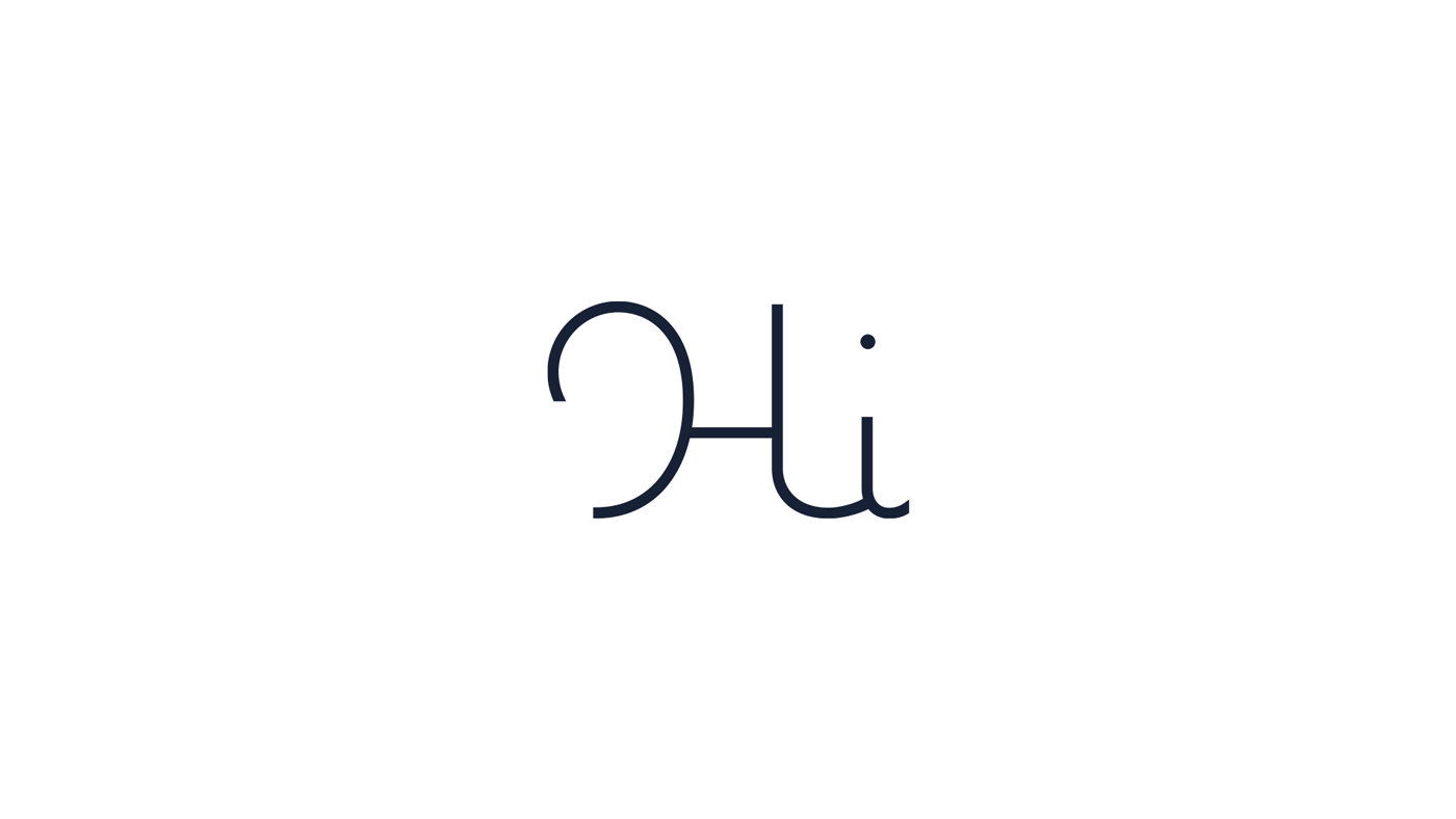
Hi, spreekt je persoonlijk aan. Hi, is beleefd, vriendelijk en bovenal nieuwsgierig. Hi, staat ook voor Headline Interactive. Digitaal gedreven creatieven. Net zo eigenzinnig als de naam doet vermoeden sluit deze merk identiteit aan bij de nieuwe filosofie van het bedrijf waarbij digitale innovatie en creativiteit hand in hand gaan en gedreven worden door een persoonlijke aanpak. Het logo ontwerp versterkt het woord Hi. De uitdijende lijnen benadrukken het woord zoals een uitroepteken dat ook doet. In kleur werkt het logo als een neon-reclame op de muur van een winkel. Opvallend, eigenzinnig en creatief!
Hi, speaks to you personally. Hi, is polite, friendly and above all curious. Hi, also stands for Headline Interactive. Digitally driven creatives. As quirky as the name suggests, this brand identity is in line with the company's new philosophy where digital innovation and creativity go hand in hand and are driven by its personalised approach. The logo design reinforces the word Hi. The expanding lines emphasise the word like an exclamation mark does. In colour, the logo works like a neon advertisement on the wall of a shop. Striking, unique and creative!